
By Damon Thomas – Design Director, LEED AP, NOMA
In Chronicle 17 (Part 1 of Annual/Performance Reports), I offered my view points on the importance of these reports and where print in some cases may be a superior option over digital.
In this Chronicle, I’d like to discuss the value of design
for Annual and Performance Reports using 5 design elements that I feel are important:
1. Tell Your Story
2. Highlight Your Achievements
3. Use Relevant Graphics To Help Your Message
4. Use a Good Design Concept
5. Be Versatile With Print & Digital
We will take a look at a Performance Report done for a client of ours; The Central Woodward/North End Collaborative (CW/NE) as well as some other reports I feel illustrate value of design.
1. Tell your Story. Nothing tells it better than good photos. Hiring a professional photographer will add to the cost of your project, however a good photographer can produce unique images that are tailored to your organization. If a professional photographer can't be obtained, sites like Shutterstock.com or Fotolia.com are options for royalty free stock photos. Makeuseof.com is a blog that list free stock images sites. I
personally like Istockphoto.com for its stock of not only high quality photos
but vector art, flash files, video and audio clips. Whichever route you decide, your graphic
designer should know how to best arrange the photos to tell your story. Autoliv is a company developing auto safety
systems at all levels including bike riders. The photos from their 2012 AnnualReport below illustrate their goal without reading a single word.1. Tell Your Story
2. Highlight Your Achievements
3. Use Relevant Graphics To Help Your Message
4. Use a Good Design Concept
5. Be Versatile With Print & Digital
We will take a look at a Performance Report done for a client of ours; The Central Woodward/North End Collaborative (CW/NE) as well as some other reports I feel illustrate value of design.

2. Highlight your achievements. Don’t think of it as bragging. Potential donors want to see what you’ve done. Most won’t read a plain spread sheet or chart. Let your designer guide you to the best arrangement. In LISC Detroit Annual Report 2011, I love the large titles and numbers that allow me to assess how much LISC Detroit has invested in education initiatives. The bold color evokes emotion along with two cute photos of children learning (the cute images of the children add a nice touch).

3. Use relevant graphics to help your message. Your graphic designer should create interesting charts or infographics to explain your goals. In Starbucks's 2012 Global Responsibility Report, one goal of the company is to reduce energy + water consumption in its stores. I really like the symbols such as electric cords & water drops to emphasize the energy & water use measured in this chart. Using these relevant graphics vs. the standard bar graphs resonate and connect the reader with the message. Being a LEED AP, I read this graphic and not only wanted to design a report for Starbucks but immediately started thinking of sustainable ideas for their stores.

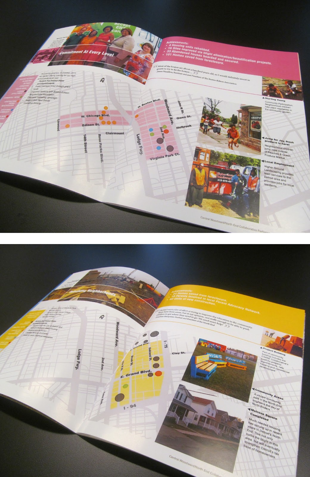
4. Use a good design concept. The design concept will set the tone for the cover and the entire report. The concept will mold and dictate how the graphics are chosen and/or displayed, so don’t take this lightly. One challenge we had assisting our client Central Woodward/North End Collaborative (CW/NE) with their performance report was coming up with a theme that conveyed a message of the 5 different non-profits working together in this organization (Central Detroit Christian, Vanguard CDC, Focus: HOPE, 4C – Child Care Coordinating Council & New Center Council - merged now with Midtown Detroit).

The collaborative gave me a theme to their report: “Partnering to Rebuild Detroit One Neighborhood at a Time”. I looked at words & phrases that I felt best described who this organization is & what they do; Team Work, Collaboration, Community etc. I looked at images I could associate with these words or phrases. After thinking, searching, sketching & designing I found an image of a rope that best conveyed what this collaborative was about. Each organization was a strand. The strands woven together make the (strong) rope. The image I purchased on-line had strands of different colors woven together. I saw this and thought, “This is perfect!” I gave each organization a color which enhanced the concept (view conceptual images slideshare).

From here the report was divided in 5 sections (after the introduction of the collaborative as a whole of course). Each section displayed each organizations contribution to the collaborative. The color from each strand became the color scheme of each section (i.e. Central Detroit Christian - Pink, Vanguard CDC – Yellow and so on).

5. Be
versatile with print & digital.
I mentioned in Chronicle 17 of this blog,
“…..…. Downloadable PDF Reports may save you printing cost but it still
takes the same time and effort to produce the content / graphics…….In most cases it’s best to have both options (printed copy
& digital copy) available………”
The CW/NE
Collaborative Performance Report has both versions available (print &
digital). Regular PDF files are good and
we use these file types. If the file
size is small enough you can e-mail these, but if you want to really impress
and reach more people, I suggest using one of the on-line publishing sites like
Yudo or Zmags (there are several). We
use an online publication site called ISSUU.com. This site creates PDF files into an
interactive book that you actually flip through (very cool).
In conclusion, don't overlook the importance of organization, good writing and editing. These are very important elements to your report as well. Good design will bring your report to life, inspire donors/supporters and give your report more value. As always I hope this information was useful. Thanks for reading.
No comments:
Post a Comment