By Saundra Little, AIA, LEED AP, NOMA, Principal
In connection with our Chronicle 17 + 18 blog
posting on design of annual reports and “big” data graphics on architecture
and urban communities (Infographics)
– We go inside our studio to discuss our use of Architecture + Graphics.
How + Why does CDS merge Architecture +
Graphic Design?
Few
architects set out to be graphic designers. But the organization of visual and
textual content comprises a large percentage of an architect’s daily
responsibilities in a small firm: architects must produce proposals,
presentations, and other printed and digital materials to communicate with
clients and collaborators.
We believe creative problem-solving with 3 Dimensional Brand-Driven solutions will change the world around us.
“Art
and Architecture are practices, not sciences.”
-Dave
Hickey
This concept of [practice] is our approach here at Centric Design Studio (CDS), and we invite our readers”
Inside the studio” as we develop our practice and design thinking.
Centric Design Studio’s Mission Statement:
Centric Design Studio is a merger
of architecture and graphic design practices.
The architecture (space) and the brand experience (business identity)
relates to one another. Our method of
practice gives structure to and communicates the relationships between an
organization a whole, its divisions, its individuals, as well as its products
and services, all with the objective of design value. “Good sustainable design is good business”.
We strive to solve the client’s problem and
exceed their expectations. Each
of our studio members are actively researching and implementing new concepts
daily in our work transforming “knowledge into design”.
How does CDS designers
want to communicate A + G in their work?
Research- Centric Practice
CDS
Studio A+ G Book/ Research List:
1. “Graphic Design in Architecture”
by Liying Zhou
2. “Graphic Design + Architecture: A 20th-Century History”
by Richard Poulin
by Liying Zhou
2. “Graphic Design + Architecture: A 20th-Century History”
by Richard Poulin
As
architect James Stewart Polshek says in his introduction, “Buildings can tell
stories.” They do this not only through their own form but also through a
“synthesis of graphic design and architecture.”
Case Study: Hair Essentials Salon Studios - Ann Michigan
 |
| CDS Computer Rendering "A" Color applied based on a individual Salon Studio Theme |
 |
| CDS Computer Rendering "B" Wall Graphics applied based on a individual Salon Studio Theme |
In
our latest project Hair Essentials Salon Studios we are incorporating a graphic
element into the architecture of a project providing a big message with
minimal construction and cost. We see graphics as a tool for bringing a
different scale and sometimes a new texture into a project that does not
otherwise have the budget or program for a refined materiality.
 |
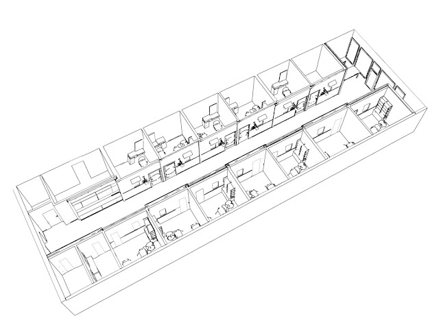
| Salon - Centric Design Studio 3D Floor Plan 13 Individual Studios - requiring 13 individual design themes |
 |
| HESS Spa Room 1- Theme room "A" Calm colors and rich textures used for making a relaxing setting. |
 |
| HESS Black + White Suite - Theme room "B" Bold wall Graphic used as a focal point |
Whenever possible, we try to take the opportunity to collaborate architecture and graphic design, as partners, expanding the conversation about spatial intentions.
Stay Tuned…..
 |
| Private, relaxing, upscale, spa setting.... All created with color, texture and graphics - Stay tuned! |


No comments:
Post a Comment